
PROJECT NAVIGATION

Walmart
To provide easy online shopping
Role
UX Designer
UI Designer
Duration
1 Month
(2021 Nov - Dec)
Tools
Figma
Adobe Photoshop
Adobe Illustrator
This project is aimed to improve the user experience for Walmart's online shopping application by refining the design logic starting from the choice of entry portals to the checkout at the shopping cart.

Walmart as one of the world’s largest retail companies has a powerful supply chain and delivery system not only benefits offline stores but also supports its online shopping service well. However, confusion and inconvenience do occur…

We can find the most frequent keywords for the customers’ complaints is a pickup, delivery, and shipping, which are also the 3 ways offered in the Walmart app for customer order distribution.
Interview story & use-flow analysis
Where do these problems come from?
Let’s see what Suzy, the new user of the Walmart app, has encountered.

The delivery option is hidden under the pickup & shipping tag.
Too many selections.
The pills are small and scrolled horizontally, which is not easy to explore.
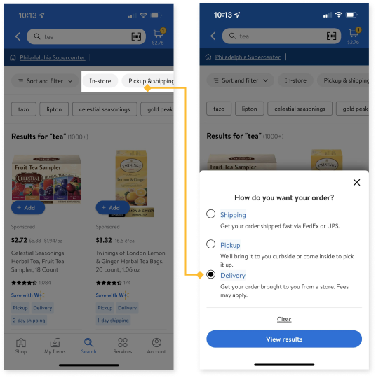


Even after choosing delivery to sort, the item tags including pickup and shipping are still shown below, which could be confusing.
After picking an item for delivery, it suddenly turned out to be a pickup item in the checkout.
The unclear distribution sorting leads to unnecessary repetition.


Insights Summary
Unclear delivery, pickup & shipping navigation from the beginning.
Lacking user guidance and alternative solutions for item shortage issues.
What do our users want?
Through our research, we could see a clear demand that users want to shop efficiently with clear instructions. In this context, users would like to avoid incompatible items, go directly to check out, fulfill the minimum requirement for free delivery or shipping service without a 2nd round.

Easy to access options to make shopping more efficient.

No ambiguity to make shopping more confident

How might we create a user-friendly distribution option system embedded in the online shopping app, so that customers can shop efficiently without spending time on incompatible items?
Solution Brainstorming
An Easy To Access Order Option
We have developed 3 different design directions for the delivery-pickup-shipping option. It’s all about improving the efficiency and clarity of the online shopping experience.

Solution 1
Order options only appear at the beginning of shopping.


Solution 2
Order options only appear at the searching step.


Solution 3
Order options are always available for users to choose & change.

Design Exploration
Order option on the homepage
Initial idea - 3 steps


Each time edit the order option requires multiple steps
Too many pages and complex interactions
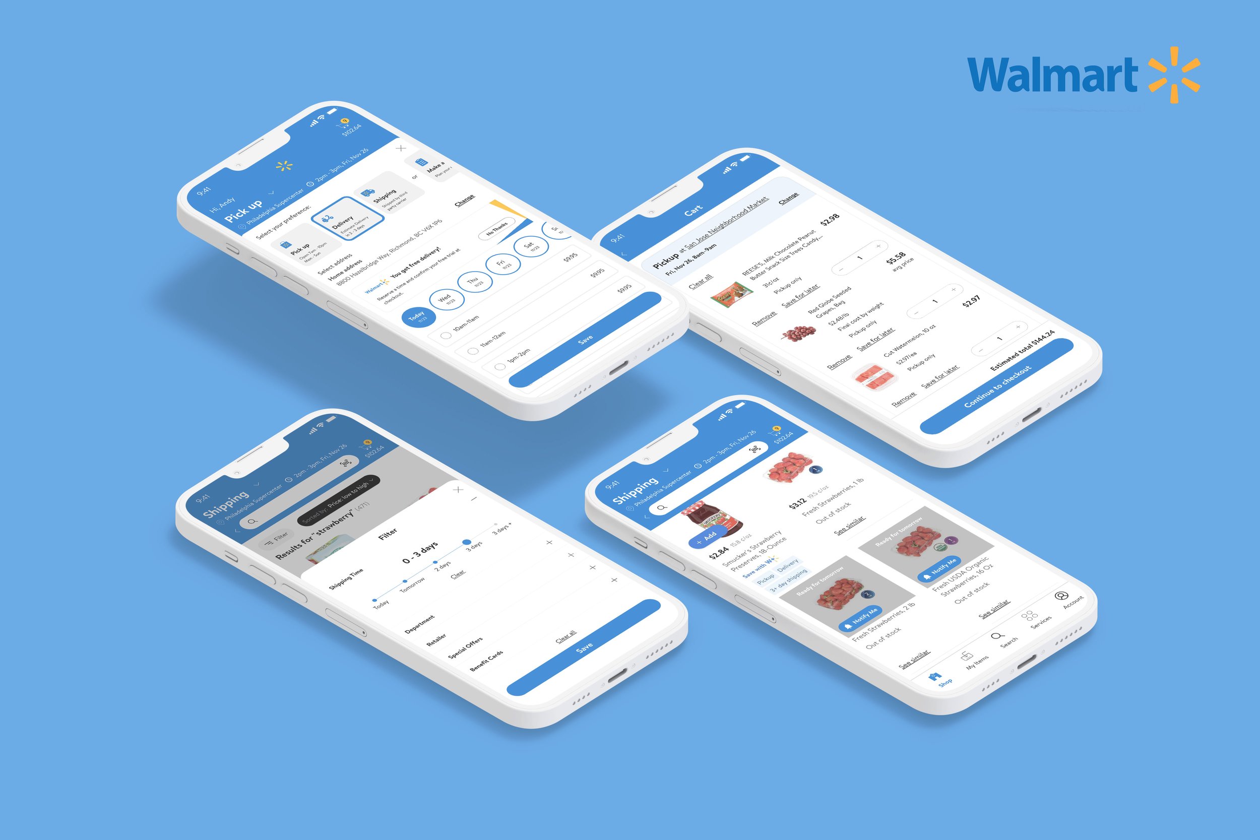
Final design - 2 steps


Information arranged in a compact way
Easily to switch to other order options
Easily edit detailed information: date, time, address & store
Order option on the search page

Original design by Walmart
Our solution

Order option details
Experiment: order option down

Selected design: order option up

Different iterations for order option location

Selected Design: balanced & separated

Order option selection: how to purchase

I also specified the icon for different order options: pick up, delivery, shipping, and make a list.

Final Solutions
Hi-fi prototypes

Choosing distribution options at the very beginning.
Simple and user-friendly filter interface to avoid confusion.


What’s new in the feature design:
Clear All
In interviews, six out of eight users say they had to clear items one by one, which is very time-consuming. Therefore, the function to clear items at once becomes very important.

Suzy says, “Now I’m feeling much more clear to shop for what I want!“
Retrospective
Though this is generally a re-design project for Walmart's online shopping app, our team actually devoted a lot of effort to usability testing, which largely fluences our decisions for design solutions. Without usability testing, we would not have a more comprehensive understanding of the needs of our users. As for the guideline of design, we believe in the effectiveness and efficiency brought by simple but direct information, which means not only visual simplicity but also the clarity of information.
